Plantify
Helping houseplant owners diagnose plant health issues with confidence — through clear, reliable, and plant-specific guidance.
Plantify is a mobile app designed to reduce confusion around plant care by giving users clear, reliable, and plant-specific guidance.
The Problem
Plant owners often struggle to identify and treat plant health issues due to overwhelming and unreliable information online. This leads to inconsistent care, confusion, and emotional stress — especially for users who are emotionally attached to their plants but lack confidence in diagnosing problems.
How might we help plant owners
diagnose problems with confidence?
The Goal
Help plant owners confidently diagnose plant health issues and maintain consistent care routines through clear, reliable, and personalised guidance.
User Research
To understand users’ challenges in caring for houseplants, I conducted a qualitative user survey focused on plant care habits, problem diagnosis, and emotional experiences.
Going into the research, I assumed users mainly struggled with remembering to water their plants. After analysing the responses, I found that the larger challenge was uncertainty and stress when diagnosing plant health problems due to overwhelming and unreliable information online.
The research also revealed that users are emotionally invested in their plants and value reassurance, clear guidance, and the possibility of community support — which shifted my focus from simple reminders to confidence-building and reliable diagnosis support.
Key Insight
“Users feel overwhelmed and uncertain when diagnosing plant problems, and existing resources often fail to provide clear, trustworthy guidance.”
This shifted the focus of the product from simple reminders to confidence-building and reliable diagnosis support.
Pain Points
Inconsistent routines
Plant owners often forget care tasks or struggle to maintain regular routines around watering, checking plant health, and ongoing maintenance.
Overwhelming information
Users often search online for answers but feel confused by conflicting advice and unclear information.
Emotional stress
Users feel worried, guilty, or frustrated when their plants show signs of illness and they do not know what to do.
Need step-by-step help
Users want clear instructions that help them act quickly and confidently without feeling overwhelmed.
Meet Lisa

Busy · caring · plant lover
Persona’s Information
- Age
- 37 years
- Location
- Oxford, United Kingdom
- Occupation
- Marketing Coordinator
- Family
- Lives with her wife and 2 kids
Goals
- Keep her family’s plants consistently healthy and thriving through better care routines.
- Grow her knowledge about plant types, watering schedules, and sunlight needs.
- Connect with a community of plant lovers to share experiences and advice.
Frustrations
- Feeling uncertain about each plant’s unique care needs and lacking reliable sources online.
- Forgetting watering schedules due to work demands — leading to guilt and stress.
- Difficulty finding trustworthy and practical plant-care tools or guidance platforms.
Bio
Lisa is a 37-year-old woman living in a three-bedroom apartment in Oxford with her wife and their two children. She and her partner share the responsibility of caring for the plants in their home. Lisa tries to maintain a plant-care routine that fits around their busy work schedules, but she sometimes forgets to water the plants, which leaves her feeling constantly worried and mentally preoccupied.
Lisa cares deeply about her plants but feels uncertain about their specific needs. When a plant shows signs of distress, she usually searches online or asks AI tools for help, but she finds the information inconsistent and unreliable — which adds to her frustration and overwhelm.
Plants hold emotional value for Lisa. When her wife gifted her a cactus for Valentine’s Day, she became especially attached to it, and when it eventually flowered she felt proud and happy. She would love a community where she could both seek guidance and share positive moments like these with people who share her interest in plants.
Lisa cares deeply about her plants but struggles to maintain consistent routines and diagnose plant health issues. She needs a reliable and simple system to reduce uncertainty and support her plant care decisions.
Our app will let users identify their plants, diagnose plant health issues, and manage simple care routines — reducing uncertainty and stress through plant-specific guidance.
Empathy Map Takeaway
The empathy map revealed that users feel emotionally responsible for their plants and experience stress, confusion, and guilt when they cannot diagnose problems or maintain consistent care.
This helped me understand that the product needed to support not only functional tasks, but also emotional reassurance and user confidence.
User Flow
The user flow focuses on helping users move from uncertainty to action — making diagnosis and care management feel simple, guided, and less stressful.
Ideation & Wireframing
I started with paper wireframes to quickly explore layout ideas, navigation options, and key user flows. This helped me test different ways of presenting plant identification, diagnosis, and care management before investing time in detailed UI design.
Paper wireframes
Sketching on paper let me prototype the full identify-and-add flow end-to-end — from a search or camera entry point through plant details, choosing a site, and confirming the new plant.
Digital wireframes
After exploring ideas on paper, I moved into Figma to refine structure, hierarchy, and usability — simplifying the diagnosis process and making important care actions easy to access.
Early Design Direction
The early design direction focused on reducing cognitive load and helping users feel guided throughout the experience.
Making plant identification easy to find
Making diagnosis steps feel clear and supportive
Keeping key actions visible and accessible
Simple structure for saved plants and routines
Usability Testing
To evaluate the usability of my wireframes, I ran user testing on key tasks — identifying a plant, navigating the app, searching, and adding plants to a personal collection. Through testing and affinity mapping, several recurring usability issues emerged.
Feature discoverability was unclear
Users did not immediately recognise the camera icon as a plant identification tool, indicating that the visual cue alone was not sufficient.
Primary actions were not accessible
Important actions, such as “Add to My Plants,” required scrolling, which disrupted the user flow and reduced efficiency.
Lack of feedback created uncertainty
The search function did not provide enough visual confirmation, leaving users unsure whether their action had been successfully completed.
Navigation caused confusion
Placing certain sections, such as “My Site,” under “My Plants” did not align with user expectations, making the information architecture unclear.
Design Improvements
Based on the usability testing insights, I iterated on the design to improve clarity, accessibility, and overall user confidence.
Improved feature clarity
Enhanced the plant identification feature with clearer visual cues and labels to make its purpose easier to understand.
Accessible key actions
Repositioned the “Add to My Plants” button to a more prominent and easily reachable location, reducing friction.
Clearer interaction feedback
Introduced clearer visual responses for search actions to reassure users and confirm successful interactions.
Refined navigation
Reorganised sections to better match user mental models, creating a more intuitive and logical flow within the app.
These iterations resulted in a more intuitive and user-friendly experience — reducing confusion and helping users feel more confident when identifying, saving, and caring for their plants.
Final Solution
Plantify provides users with a guided way to diagnose plant issues, access reliable care information, and manage their plants in one place.
Plant Identification
Users can identify plants using image-based identification or search — supporting users who may not know the name of their plant.
Diagnosis Support
Helps users understand possible plant health issues through clearer, step-by-step guidance, reducing the need to search unreliable sources online.
My Plants Collection
Users can save plants to a personal collection, making it easier to return to plant information, care routines, and future diagnosis support.
Care Routine Management
Users can manage simple care routines to support consistency and reduce forgetfulness.
Future Community Support
Structure allows room for a future community feature where users can share experiences and reassurance.
Step-by-step symptom selection turns an overwhelming online search into a guided flow that ends in a clear, plant-specific recommendation.
A personal collection makes it easy to return to plant information, care routines, and previous diagnosis support.
Reorganised information architecture surfaces site-level details in a place that better matches user expectations.
Care routines and reminders surface as a calm, scannable schedule so users can stay consistent without feeling nagged.
Point the camera at any plant to identify it instantly — removing the guesswork and giving users a fast, visual entry point.
Browse and search a curated plant library so users can find care information even without a photo.
Prototype
I turned the wireframes into an interactive Figma prototype so I could test the diagnosis and add-plant flows end-to-end before committing to high-fidelity UI.
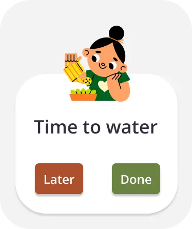
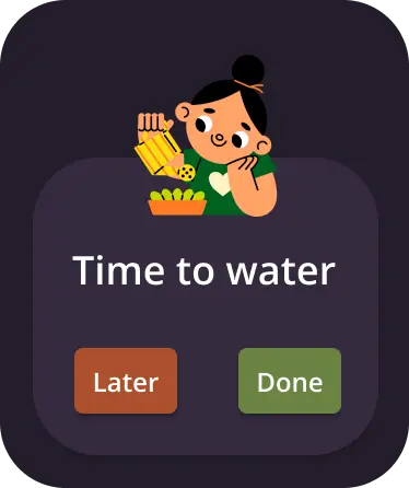
Apple Watch Companion Experience
To explore how the product could integrate into users' daily routines, I designed a simplified companion experience for the Apple Watch.
The goal was to support quick, glanceable interactions, allowing users to stay on top of plant care without needing to open the mobile app. The primary feature focuses on watering reminders, where users can quickly see when a plant needs attention, mark tasks as complete, and snooze reminders for later. I designed this screen in both light and dark modes, ensuring readability and accessibility across different environments and user preferences.
- Quickly see when a plant needs attention
- Mark tasks as complete
- Snooze reminders for later
- Reduced cognitive load through minimal UI
- Clear call-to-action buttons for fast interaction
- Consistency with the mobile app's visual language
Design Decisions
Clear visual hierarchy
Spacing, headings, and content grouping help users scan information quickly and reduce cognitive load.
Step-by-step guidance
The diagnosis experience guides users through actions instead of overwhelming them with too much information at once.
Supportive tone & UI
Because users feel emotionally stressed when plants are unhealthy, the interface feels calm, reassuring, and helpful.
Accessible actions
Primary actions are easier to find and reach, especially after testing showed users did not want to scroll for important tasks.
Accessibility
Accessibility was an important part of my design process to ensure the app is usable for a wide range of users.
Color contrast & readability
Checked the colour palette against WCAG contrast guidelines so text and key UI elements remain clearly legible.
Typography & hierarchy
Text sizes and spacing maintain readability and support users who may have difficulty reading dense interfaces.
Dark mode support
Designed two key pages as dark mode samples to explore an alternative viewing option for low-light environments.
Accessible interaction
Important actions are more visible and easier to reach, supporting users who need a clearer, more direct path through the app.
What I Learned
01.
Design for emotion
Users felt stress and uncertainty when caring for their plants. That insight influenced many of my design decisions — not just functional ones.
02.
Research challenges assumptions
I initially focused on reminders, but research revealed users needed confidence, clarity, and reliable diagnosis support more than anything.
03.
Iterate from feedback
Usability testing helped me identify moments of confusion and refine the design into a clearer, more user-friendly experience.
Next Steps
More usability testing
Test the high-fidelity designs with a broader group of users to validate improvements and uncover new usability issues.
Smarter diagnosis
Explore more advanced ways of identifying plant issues, such as improved image recognition or a more guided diagnosis flow.
Personalisation
Introduce more tailored care recommendations based on plant type, environment, user routine, and previous plant care behaviour.
Community feature
Explore a structured community space where users can ask questions, share experiences, and receive reassurance.
Refined micro-interactions
Add subtle animations, confirmations, and feedback states to make interactions clearer and more engaging.
Final Reflection
“Plantify is not only about helping users complete tasks; it is about helping them feel more confident, supported, and less overwhelmed when caring for their plants.”
By using research, usability testing, and iteration, I was able to move from a simple reminder-based idea to a more meaningful product focused on diagnosis, reassurance, and plant-specific guidance.