
Rayan Travel
Redesigning a complex travel service around the journeys that matter most.
A responsive website redesign for an Australian travel agency, focused on simplifying a broad service offering and creating clearer journeys for Tours and Cruises.
95% mobile traffic
5 moderated tests
Real client project
The Problem
Rayan Travel offered tours, cruises, flights, hotels, visas and other services, but its existing website made the offer feel fragmented. Tours led to an enquiry, while cruises used an external booking system. The challenge was to make these different journeys feel clear and connected, especially on mobile.
The Goal
Create a modern, easy-to-maintain travel website that guides visitors first toward Tours and Cruises, gives Adventure and Medical Tours distinct paths, and supports the booking models the business actually uses.
Business & Audience
Stakeholder discovery established Tours as the highest-priority homepage service, followed by Cruises. The client reported that roughly 95% of site traffic came from mobile devices, so I treated mobile usability as a primary design requirement.
The client described families, Persian and Iranian communities, and cruise travellers as core audiences, including many customers aged 45–65+. This called for readable type, familiar navigation, generous touch targets and direct calls to action.
The site also needed to accommodate staff-managed tour updates and future services without giving every offering equal weight on the homepage.
Key Insight
One travel brand, two different ways to book.
Tour enquiries and cruise bookings could not share a single checkout flow. The experience needed to set the right expectation at each step while preserving a consistent brand and navigation system.
Creating hierarchy from a long list of services
I mapped the full site before designing individual screens. Tours and Cruises became the primary destinations. Adventure and Medical Tours sit beneath Tours, while Flights, Hotels, Visas and Insurance remain easy to find as supporting services.
User Flow
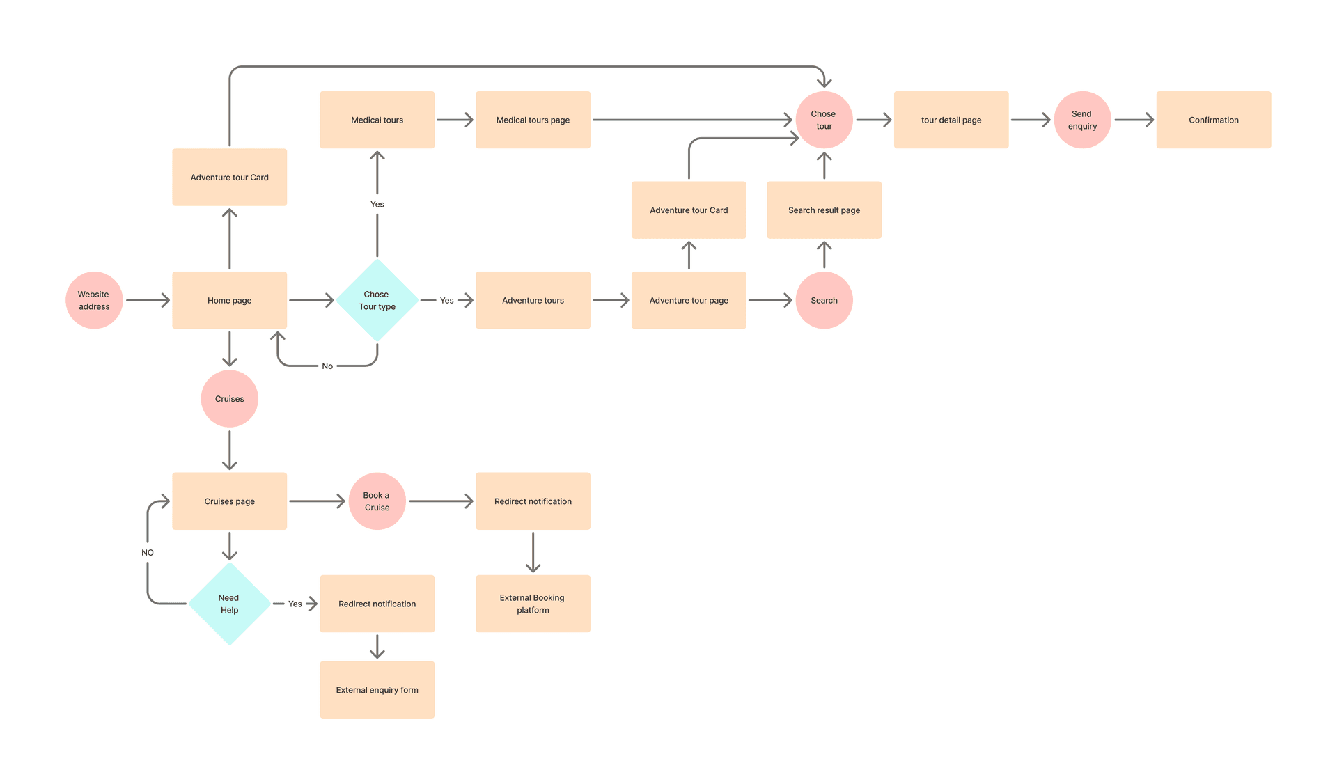
This flow maps the main paths from the homepage through Adventure and Medical Tours to an enquiry, and through Cruises to an external booking platform or enquiry form.
Ideation & Wireframing
I explored hierarchy and layout on paper, then translated the strongest directions into Figma wireframes for desktop and mobile.
Sketching the idea
Quick paper studies helped me compare the homepage, tour listing and tour detail structures before committing to a visual direction.
Structuring it in Figma
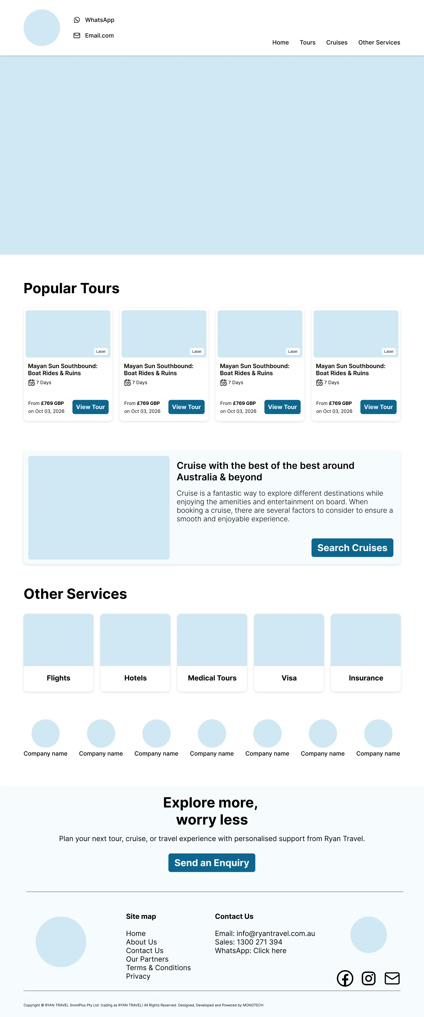
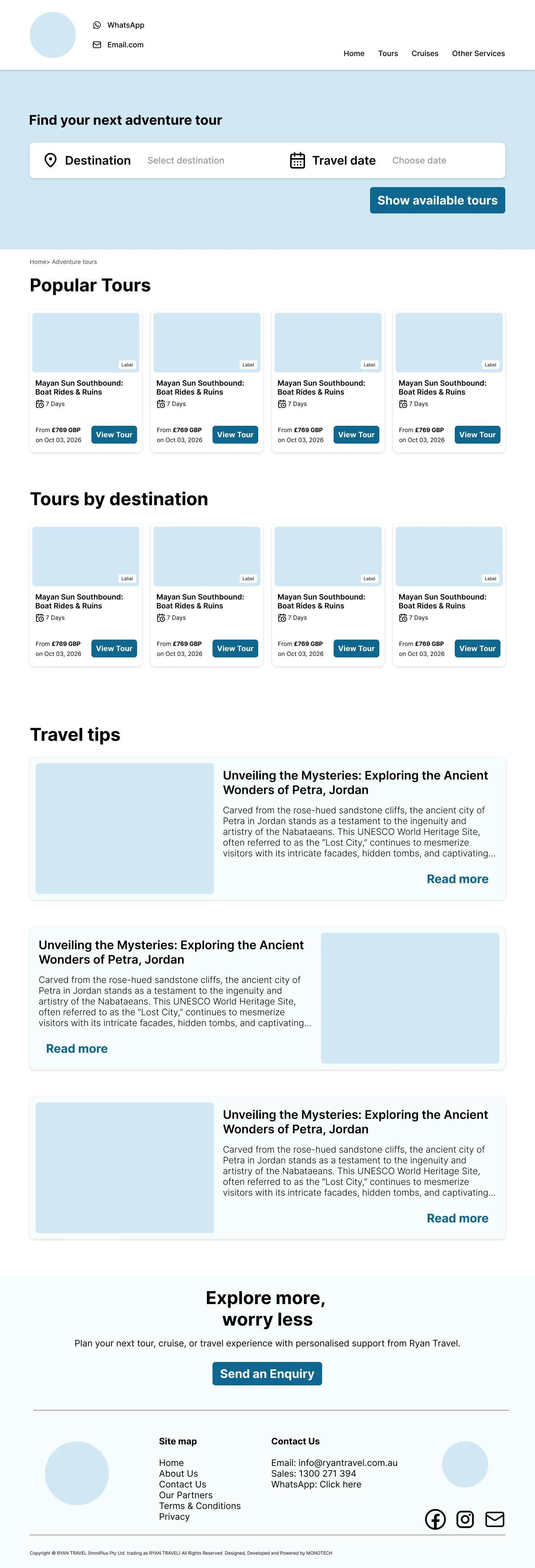
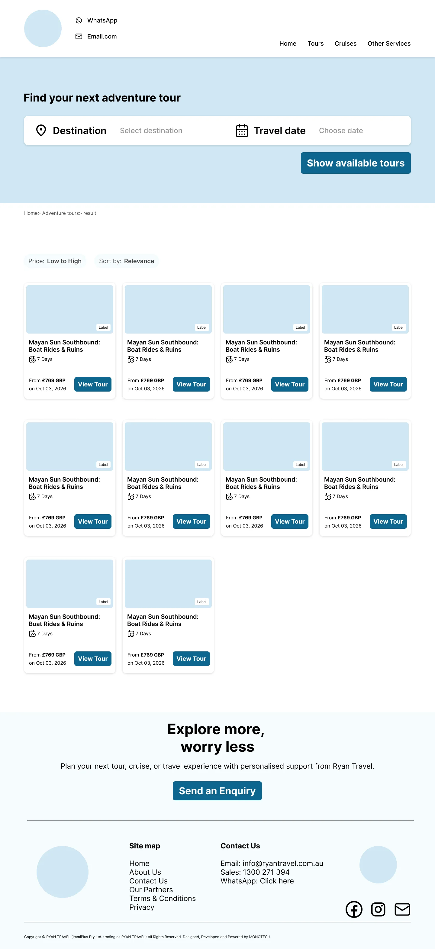
The wireframes define the page hierarchy and key interactions across desktop and mobile.





Exploring a more code-adjacent workflow
I used Figma and FigJam for discovery, information architecture, user flows, wireframes and interaction planning. At the high-fidelity stage, I experimented with Codex to iterate directly in the browser while remaining responsible for the visual direction and design decisions.
Figma for product thinking. Browser iteration for high-fidelity exploration.
Usability Testing
Across five moderated usability tests, the Cruise journey revealed an expectation gap. Participants expected cruise listings inside Rayan Travel, but booking continued on an external platform.
The click needed context
A clear call to action was not enough when the destination was unexpected. I revised the copy and action labels to explain the external handoff before visitors committed to it.
Final Solution
The redesign turns a broad service catalogue into a focused, mobile-first experience centred on Tours and Cruises. It keeps tour enquiries and external cruise bookings distinct while presenting them as parts of one travel brand.
Tours first
The homepage gives the primary business goal the clearest route into browsing and enquiry.
Separate tour paths
Adventure and Medical Tours remain distinct so each audience can find relevant trips quickly.
Clear cruise handoff
The cruise journey prepares travellers for the external booking service instead of suggesting an on-site checkout.
Built to grow
Reusable responsive patterns support new destinations, tour updates and future services.
Final screen gallery
The responsive designs show the homepage, Adventure Tours and tour detail journeys across desktop and mobile.
Design Decisions
Give priorities room
Tours and Cruises lead the homepage rather than competing equally with every supporting service.
Design for mobile readers
Readable text, direct actions and familiar patterns support the client-reported mobile audience and older travellers.
Match the real booking model
Tour enquiries and external cruise bookings stay distinct, with clear expectations at the handoff.
Make updates repeatable
Tour templates and reusable components make new offers easier to present consistently.
What I Learned
01.
Business models shape UX
The booking paths had to reflect the agency's actual operations, not a single idealised checkout flow.
02.
Hierarchy is a product decision
Prioritising Tours and Cruises helped simplify a wide service catalogue without hiding the rest of the offer.
03.
Expectations shape the journey
Testing showed that people could find the Cruise action yet misunderstand where it would take them.
Next Steps
Refine the final screens
Review the responsive homepage, Adventure Tours and tour detail designs before handoff.
Refine the cruise handoff
Carry the revised transition copy and actions into the final interface.
Measure after launch
Review mobile engagement and tour or cruise enquiries once implementation data is available.
Final Reflection
A clear travel experience starts by making the next step obvious.
Rayan Travel brought together business priorities, a mobile-heavy audience and different booking systems. The project taught me to balance what visitors need to understand, what the business needs them to do and what the product can support.