Sisterly
Improving event discovery, event details, privacy, and accessibility for a community-focused events experience.
Sisterly is a community app for women. I audited the existing event flow and redesigned the event listing and detail experience so users can find relevant events, understand key information faster, and feel safer when deciding whether to attend.
The Problem
The existing event page made it harder for users to quickly find relevant events nearby, understand practical details, and feel fully in control of their privacy when attending community activities.
The Goal
Redesign the event experience around search, location, clear hierarchy, privacy, and accessibility so users can move from discovery to decision-making with less confusion and more confidence.
User Research
Before redesigning, I reviewed the existing event experience to understand what was already working and where the user journey could be improved.
The page already had a strong foundation: event categories helped users understand the type of event, organiser details supported trust, and comments created space for community interaction.
The audit also revealed friction points around limited search, unclear location information, unnecessary availability labels, privacy concerns around attendee visibility, disconnected price placement, and missing accessibility details.
Key Insight
Community features need to feel social without making users feel exposed.
The redesign keeps the community feeling through friends attending and discussion entry points, while avoiding random attendee visibility and making practical event details easier to scan.
Pain Points
Limited discovery
Users needed a faster way to search for events by interest, topic, keyword, or location.
Unclear location
In-person and online events needed clearer location labels so users could quickly understand whether an event was realistic to attend.
Visual clutter
Availability numbers such as large spot counts added noise without helping users make a decision.
Privacy and safety
Showing random attendee faces could make users feel uncomfortable in a community-focused app.
Ideation & Wireframing
I mapped the redesign around the main flow: users open Events, search or filter by location, find a relevant event, check the details, then save or join.
From Existing Flow to Wireframe
The audit helped separate useful information from visual noise. I kept trust-building elements such as organiser details and community discussion, then reorganised search, filters, event cards, accessibility information, and the join CTA.
Design Improvements
The redesign focuses on making event discovery clearer while supporting privacy, safety, and inclusive decision-making.
Search and location
A location selector and search bar help users find events by city, topic, category, or keyword.
Useful filters
Primary discovery stays simple, while detailed filters such as date, price, accessibility, distance, and format can live in a filter panel.
Cleaner event cards
Cards prioritise title, place, date, time, price, availability only when useful, and quick save/share actions.
Privacy-conscious social proof
Friends attending replaces random attendee faces, preserving community context without exposing users unnecessarily.
Rather than changing only the visual style, the redesign solves practical problems around finding events, understanding details, and feeling comfortable attending.
Final Solution
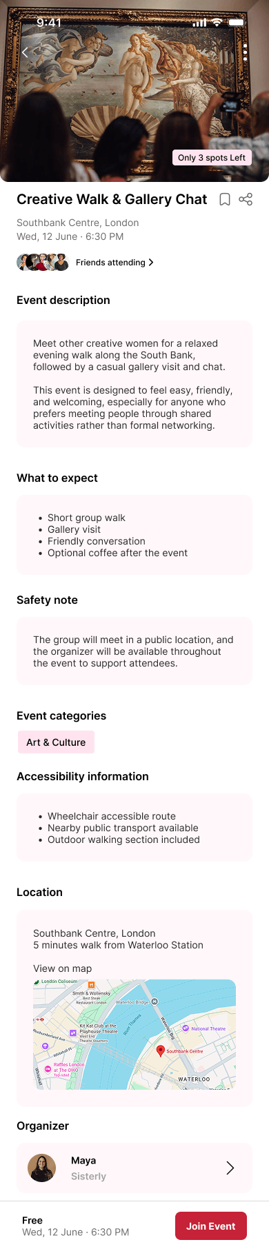
The final design gives users a clearer route from event discovery to joining. The listing page supports search and filtering, while the detail page groups description, expectations, safety, categories, accessibility, location, organiser information, and discussion in a calm, scannable structure.
Event listing
Search, location, filters, clearer cards, save, share, price, and only meaningful urgency labels.
Event detail
A stronger information hierarchy helps users understand what the event is, where it is, and what to expect.
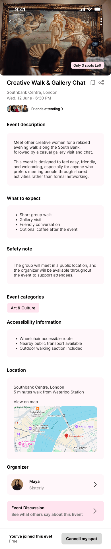
Joined state
After joining, the CTA changes state and surfaces cancellation clearly without creating uncertainty.
The events page starts with location and search, then presents event cards with the details users need before tapping in.
The event page breaks long information into clear sections, including event description, what to expect, safety, accessibility, and location.
The design keeps social context through friends attending while reducing exposure to unfamiliar attendee lists.
Accessibility information is included before the join decision so users can assess whether the event suits their needs.
Accessibility
Accessibility became a core part of the redesigned event detail page, not an afterthought.
Access details
The detail page includes accessibility information such as wheelchair access, nearby transport, and outdoor walking sections.
Clearer hierarchy
Sections are labelled clearly so users can scan for the exact information they need before joining.
Decision support
Safety notes, location details, and organiser information help users feel more confident before attending.
What I Learned
01.
Audit before redesign
Reviewing the existing flow first made it easier to preserve useful trust-building features while removing friction.
02.
Privacy changes tone
Small content decisions, like showing friends attending instead of random attendees, can make a community product feel safer.
03.
Details drive confidence
Accessibility, location, safety, and price are practical details that directly affect whether someone feels ready to join.
Next Steps
Test discovery
Run a quick usability test to see whether users can find a relevant event using search, location, and filters.
Validate privacy settings
Explore profile-level attendance visibility controls so users can decide when their activity is shown.
Moderate discussion
Define reporting, moderation, and community guideline patterns for safer event comments.
Final Reflection
The redesign aims to make Sisterly events easier to find, safer to join, and clearer to understand.
This case study strengthened my understanding of how UX audits can guide focused redesign decisions. By improving search, information hierarchy, accessibility content, and privacy-conscious social features, the event experience becomes more useful and more comfortable for users.